

Maximising space - the ‘£ per square inch’ approach
In the previous issue we featured an article by Matt Cummins of Cloud Retail Consultancy on the importance of visual merchandising in retail. Catch up HERE if you missed it. In this second part on visual merchandising, Matt looks at some relatively quick and easy things you can do to maximise your chances of a sale, and minimise the opportunity for your customer to leave the shop disappointed and empty handed.
Where a large expansive retail store looks at turnover by square foot or indeed metre, our equestrian shops are famously full of many thousands of SKU’s. We and our horses need so many bits and pieces, that stores often resemble more of an ‘Open all Hours’ - Arkwright’s general store. To be successful, we need to zoom in to focus on the detail.
Like a teenager’s bedroom!
A customer of mine once described her small and very full shop as being like a teenager’s bedroom, in the sense that every surface, whether a shelf or wall, it was covered in ‘stuff’.
Space is a premium, particularly with business rates being as high as they are, so here are a few key points to consider when merchandising your products:
- Location – before we deliberate on how an item is presented, we need to consider where it’s located.
- Language and Lighting – poorly signposted, everyday items placed on overhanging shelves or under inadequate lighting will not sell.
- Lines – human beings love order over chaos, straight lines go a long way to soothe the stressed mind.
Location
The local of a product or brand is crucial. Similar to the hot spot plan mentioned in the last feature (observing and marking your customer’s journey through your store) putting yourself in their shoes also works well.
Thinking financially for a moment, consider which items in your shop have the highest margins and therefore the greatest return on your investment.
Ideally, every higher margin product usually a 1.8 to 2.0 mark up should be given prime location in your business. They should be visible from the front of the shop, depending on your store’s structural layout, ideally on the back wall if open plan or within a feature bay or gondola towards the middle of the shopping space.
You want to literally entice them in, the lure of the latest seasonal jacket, legwear or country boots should draw them off the doormat and into your space.
Create branded locations throughout your space, if a certain top brand is present, does your area reflect the values or appeal of that brand? Try and turn that location into a ‘shop in shop’. Consider different flooring, an appropriate rug, graphics, lifestyle photography, all nods to the brands origins (i.e. USA, European or British).
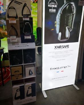
Being critical for a second, far too often we see a wide range of brands displayed in shops on exactly the same silver 4-way gondola or generic white slatwall. You’re assuming too much of the customer by not giving them enough visual clues to the brand itself. Certainly not calling out the fact that you’ve spent a small fortune on this clothing or boot collection!
Let margin - and being blunt, what you expect to make from it - dictate where and how a product is displayed. The latest spring/summer collection from a brand should be displayed as one coherent display on a back wall.
Hopefully, you’re familiar with the concept of a golden line, utilised by supermarkets to sell canned goods but equally by high-end boutiques to use absolute laser focus to highlight their key pieces. The golden line is between 1.3m and 1.8m from the ground. This is the on average from torso to the top of the head. The optimal height, easy to see, easy to reach, and given we all make eye contact and look straight ahead, this is where you want your customer’s full attention. The theory goes that everything within this magical measurement sells (or at least should do!).
Language and Lighting
So your ‘destination shopper’ who came in for that latest must-have jacket, pair of flattering breeches or pair of suede country boots they’ve been dreaming of, heads straight to where the spotlight shines brightest and branding is clear.
What about your regular, everyday essential items, the product we fill our baskets with on a weekly basis? Here is where clear language and lighting come into play.
Don’t be afraid to speak to your supplier or friendly rep to ask for signage, maybe even point of sale displays. Let the brands you spend with do some of the heavy lifting. Let them help your customer find what they want and need. You want the customer to very quickly understand the layout of your shop.
- Where are the supplements?
- Where are the headcollars and leadropes?
- Where are the grooming products and shampoo’s?
Like water, our customers want to find the most direct, efficient route.
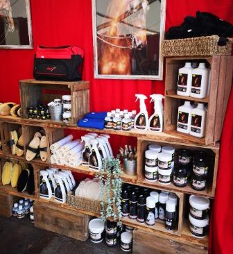
Well lit, clear signage will show them the area to fill their baskets. Ensuring shelves are branded with shelf-edge strips, or perhaps grouped by category under an evenly lit display. Use the customer’s language, don’t be afraid to use informal phrases such as a sign saying ‘Lotions and Potions’ or ‘Tame the Mane’ to indicate a specific department.
Lines
We don’t all need to have OCD (though let’s be honest it does help in our business sometimes) to know that straight lines, sharp (metaphorically speaking) edges and forward facing labels are crucial.
This flows from the language and lighting topic, now you’ve lured your customer to the location, show off how much choice you have!
However you choose to group products, either by type, such as all shampoos or all mud fever treatments together, or strictly by brand on one shelf, the important thing is to observe both vertical and horizontal lines.
When faced with crowded pharmacy-like shelving or an upcycled wooden book shelf, usually the packaging is similar, 100ml, 250ml or 500ml spray bottles, tubs of ointment all shouting for attention.
Pyramids and specifically an a-symmetrical pyramid is the most powerfully psychological and pleasing shape. Think of a pyramid or triangle shape as an aspirational, upwards pointing, positive shape. For example, taking three mannequins, a tall male, a slightly shorter female and either a seated female or even standing female child, would be arranged with the male in the centre and the females either side.
In terms of a shelf display, a 500ml spray bottle in the centre, with a 250ml one side and a 100ml tub the other. Try these techniques and you will instinctively know what feels or looks right.
A silly thing like facing all the labels forward, placing stock in neat rows behind one and other and ensuring the pricing on the shelf edge matches those above it are off-putting, if not done well.
In supermarket terms, these are your FMCG – Fast-moving Consumer Goods.
Your FMCG or grocery items should be the core, essential purchases that underpin daily or weekly sales.
The items that customers ‘need’, whilst the more luxury, or impulse products are the items they ‘want’.
Ultimately as commercial professionals, we ‘want’ our customer’s to ‘need’, and indeed ‘need’ them to ‘want’ for us to be successful and make a living.
Blending your shop layout with both want and need is really the secret to success.
In summary, visual merchandising is simply about clear communication between yourself and your customer, the product within your shop is your vocabulary.
I’d love to hear how you get on with this and would be more than happy to help advise or offer individual support. Matt Cummins. Cloud Retail Consultancy. Tel: +44(0)7923 363767 Email: cloudretailconsultancy@outlook.com